Brooke Rodd
With a focus on information architecture and accessibility, this redesign aims to create a more enjoyable experience for Brooke Rodd’s online shoppers
2 week design sprint
Role
Solo Project - UX/UI Designer
Timeline
Tools
Figma, Zoom
Overview
Problem
Solution
As a charming local boutique, Brooke Rodd excels at delivering an exceptional in person shopping experience. While their brick-and-mortar success is undeniable, their online presence has taken a backseat. “We don’t have the resources quite yet to put loads of energy and time into our online website” said a sales associate when I called to ask about their current online engagement.
Enhance Brooke Rodd’s current e-commerce site with a focus on information architecture, navigation, and accessibility to help them improve overall user retention, and create a seamless and enjoyable user experience.
Brooke Rodd is a locally owned boutique based out of Santa Monica, California. Consisting of four brick and mortar stores and an online shop, the boutique offers an array of products such as home goods, clothing, accessories, art, stationary, kids toys, and more.
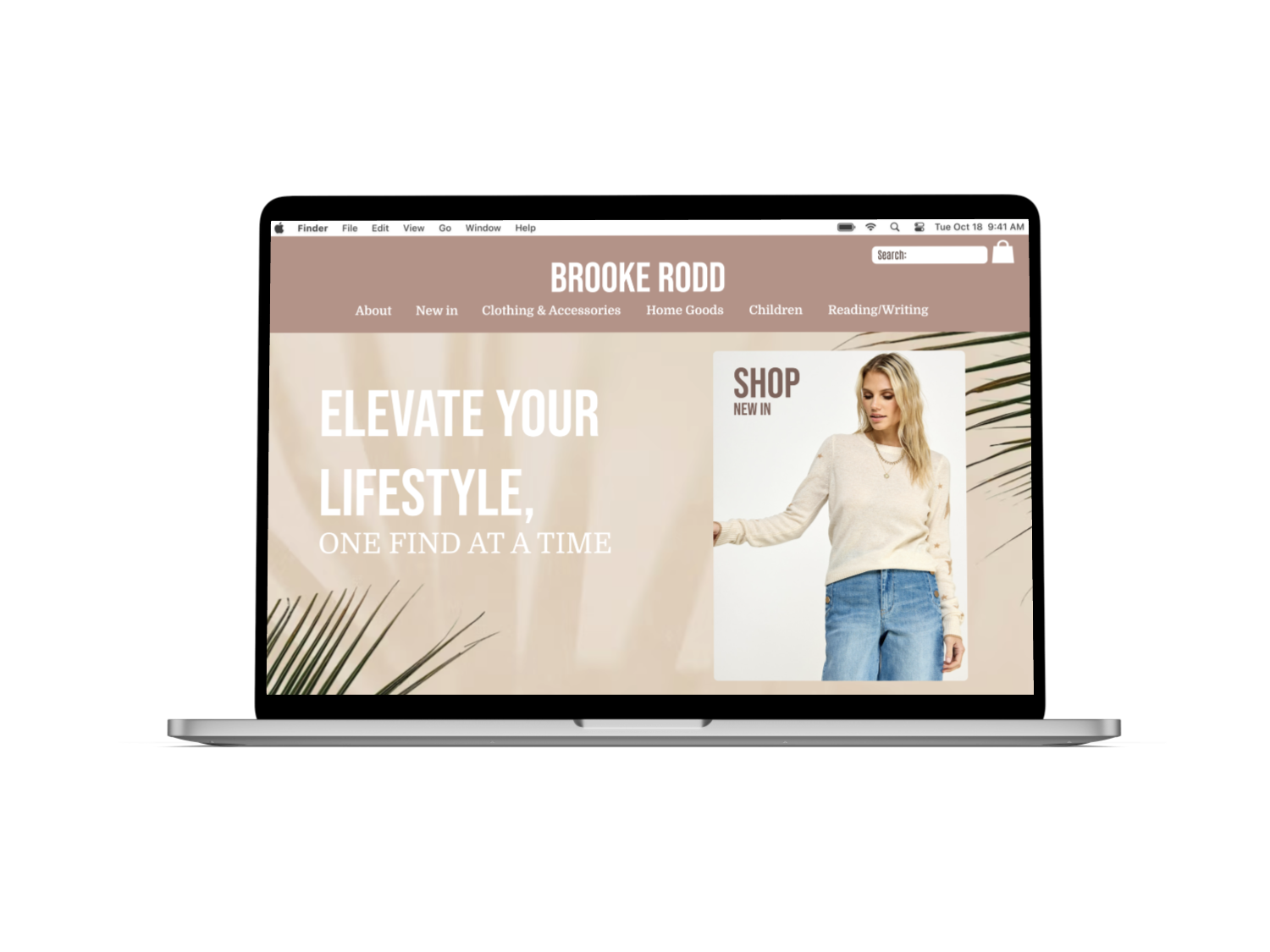
Take a look at the final prototype!
Research Question
How do users go about purchasing items on Brooke Rodd’s current website and what pain points might they run into along the way?
User Interviews
1. Payment
Users want various payment options including express checkout methods.
3. Filters
Users want the ability to use various filters to narrow down their product search.
Understanding what users need when it comes to an enjoyable online shopping experience
To begin, I conducted 4 user interviews with those who consider themselves regular online shoppers, or have shopped at any local boutique similar to Brooke Rodd before. I wanted to learn what their definition of of an ideal shopping experience looked like. I asked them various questions about their behaviors, preferences, and motivations when online shopping. After synthesizing my interview findings into an affinity map, I was able to pinpoint some reoccurring themes…
2. Reviews
Users want the ability to see and write product reviews.
4. Descriptions
Users want to see detailed, thorough product descriptions.
Affinity Map

Usability Testing
Through my usability tests, I discovered many insights. Listed below were some of the reoccurring findings.
75%
100%


“I only saw PayPal as an option when checking out, I normally use ApplePay or ShopPay so that was frustrating.”
Of users were disappointed in lack of product description details. While some items on the site had fairly sufficient descriptions, other products had none at all.
Opportunities for improvement:
Consistency and quality of product descriptions
Of users had trouble locating the kids section as it was labelled in another language as “bambino”. The overall product navigation felt unorganized.
Opportunities for improvement:
Verbiage consistency
Ease of navigation
50%
Of users wanted to use other third party payment options other than PayPal such as ApplePay, ShopPay, GooglePay, etc.
Opportunities for improvement:
Provide multiple third party payment options to cater different user needs
From here, I wanted to gain insight into how users interacted with the current Brooke Rodd site to understand their pain points.
So, I set up some usability tests and had users complete a simple task which allowed me to discover their natural actions, thoughts, and instincts. I set up four zoom meetings and observed users as they completed the task.
“The product categories felt a bit unorganized which made the shopping process more difficult than I would have liked.”
Some other key findings from my usability tests
“I didn’t love the visual aspect of the site, it felt a bit boring and didn’t leave me excited to purchase the product.”


Game Plan
Pulling from my research insights I decided to focus on 3 main themes to integrate into the redesign of Brooke Rodd’s current website.
How might we simplify navigation through information architecture?
How might we ensure consistent product details, descriptions, and reviews?
How might we expand on current payment options to cater to different user needs?
Persona

Meet Sarah!
Identifying and getting to know the user
Based on my user research as a whole, I was able to condense my findings into one persona focusing on common behaviors, needs, and pain points.
Bio
Sarah is a 30 year old busy working mom who loves to shop locally in her free time. She is passionate about all things home, wellness, and quality of life.
-
Regular online shopper
Busy mom who values efficiency
Loves to shop locally
Usually uses ApplePay or ShopPay
-
Wants an easy and seamless online shopping experience
Needs sufficient filtering options
Needs site to save payment/shipping/billing info
-
Does not like when shops have limited payment options
Is annoyed when sites don’t save her payment/shipping/billing info
Get’s frustrated when products don’t have sufficient reviews and descriptions
Feature Analysis
Key Takeaway
Comparing and contrasting different features on competitor sites
To gain a better understanding of the strengths and weaknesses of different competitors, I completed a feature analysis of 3 companies similar to Brooke Rodd. My criteria for choosing these companies was based on scale and product categories.

Although it may seem at first glance that Brooke Rodd has successfully implemented most feature’s listed, it was the execution that was missing. For example, although Brooke Rodd offers online ordering, that does guarantee a successful shopping experience. Likewise, although Brooke Rodd offers PayPal as a third party option, it does not offer other options such as ApplePay or ShopPay.
User Flow
Mapping out the initial user flow
Before jumping into wireframes, I mapped out my initial user flow to gain a better understanding of the steps users needed to take to purchase a product. *User flow subject to change post usability testing*.

Wireframes & Iterations

Testing my initial designs through usability testing
After designing my first round of wireframes, I wanted to see how effective my design choices were, and discover any further iterations that might need to be made. So, I conducted another round of usability tests. I gathered four users and had them navigate throughout the site as if they were buying a candle as a gift.
Iteration #1 - Restructure Information Architecture

Finding:
3/4 users clicked on “Home Goods” instead of “Scents” to find a candle. The Navigation was unclear.
Solution:
Removed “Scents” category and made candles a subcategory under “Home Goods”.
Iteration #2 - Ensure accessibility
Finding:
2/4 users had trouble seeing the cart icon. It was lacking in size and contrast.
Solution:
Enlarged the cart icon and filled it to add contrast and increase visibility.

Iteration #3 - Cater to different use cases
Finding
2/4 users noticed there was no “purchase as gift” option. Because they were prompted to buy the candle as a gift, this was a very helpful insight.
Solution
Added an option for shoppers to “purchase as gift”, catering to different use cases.
Key Takeaways
Reflecting on the journey
As one of the first comprehensive projects that I worked on in a 2 week sprint, I learned a ton about…
The importance of effective information architecture to help users get to their desired product easily.
The importance of accessibility and making sure things are clearly visible.
The importance of finding solutions for different use cases weather that is providing gift options, various payment methods, etc.